Concept & Identity
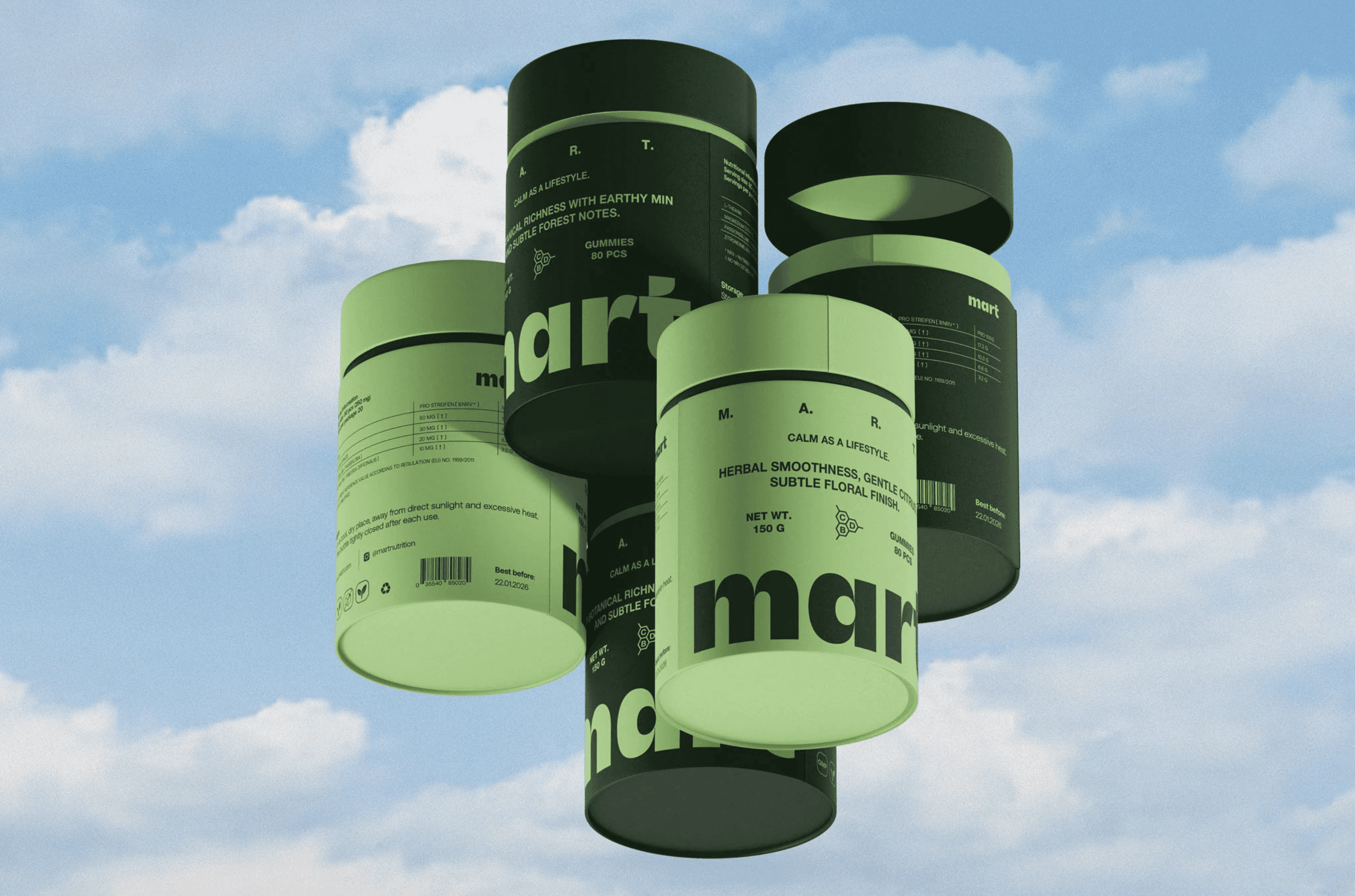
Mart redefines daily CBD as a grounding ritual rather than a clinical routine. Bold color-blocking, approachable typography, attracts a younger gen-z audience, exactly what Mart wanted their consumers to be.
Packaging + Visual System
I wanted to push CBD packaging away from typical clinical tropes and into something that feels intentional on a nightstand. I built the visual palette around forest green, solar yellow, and sky blue to evoke clarity and natural vitality without feeling earthy or medicinal. On the matte jars, I kept the label hierarchy strictly minimal, pairing high-contrast typography with a custom mark so the science feels approachable and the shelf presence stays clean.