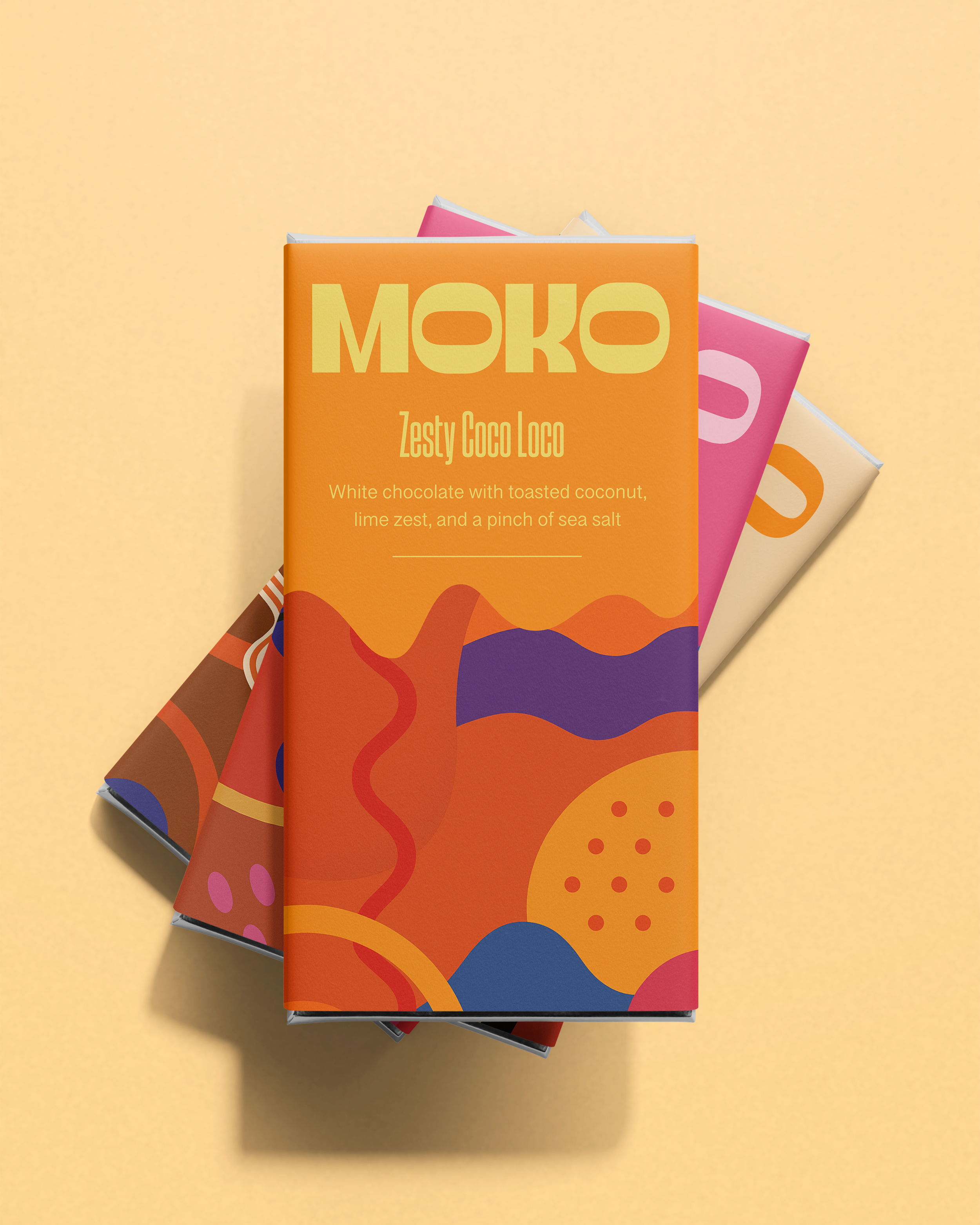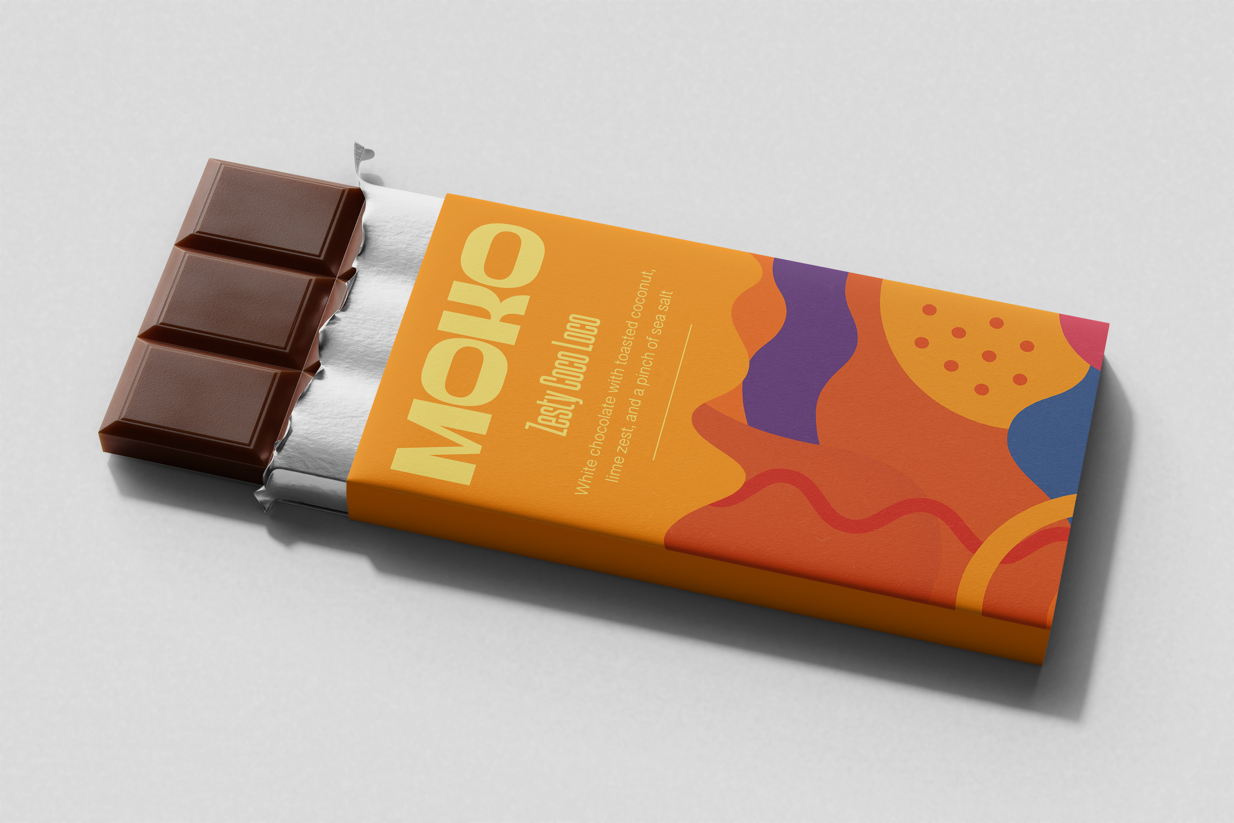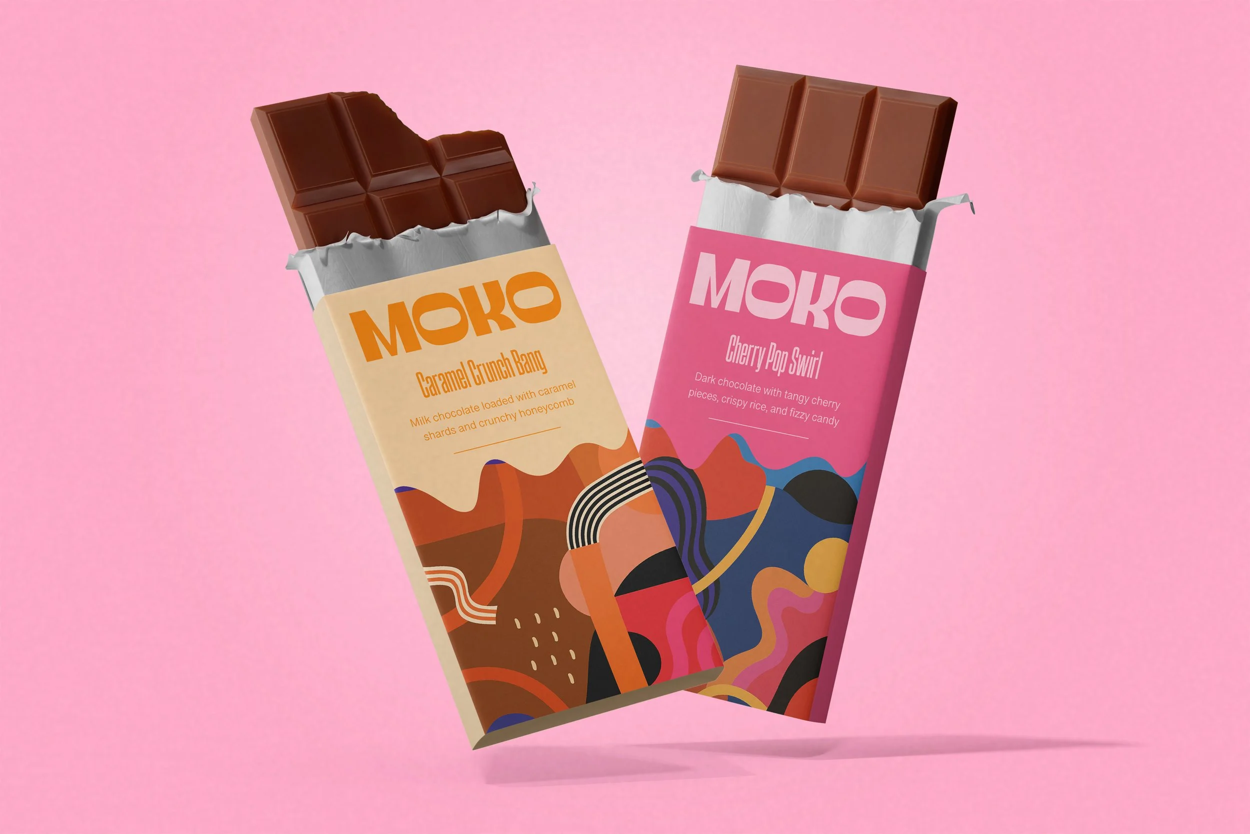
Moko Chocolate
This was such a fun one to work on. I designed the branding and packaging for MOKO chocolate, a bold brand that doesn’t shy away from flavor or colour. The task was to create a visual language that feels as expressive and layered as what’s inside the wrapper.
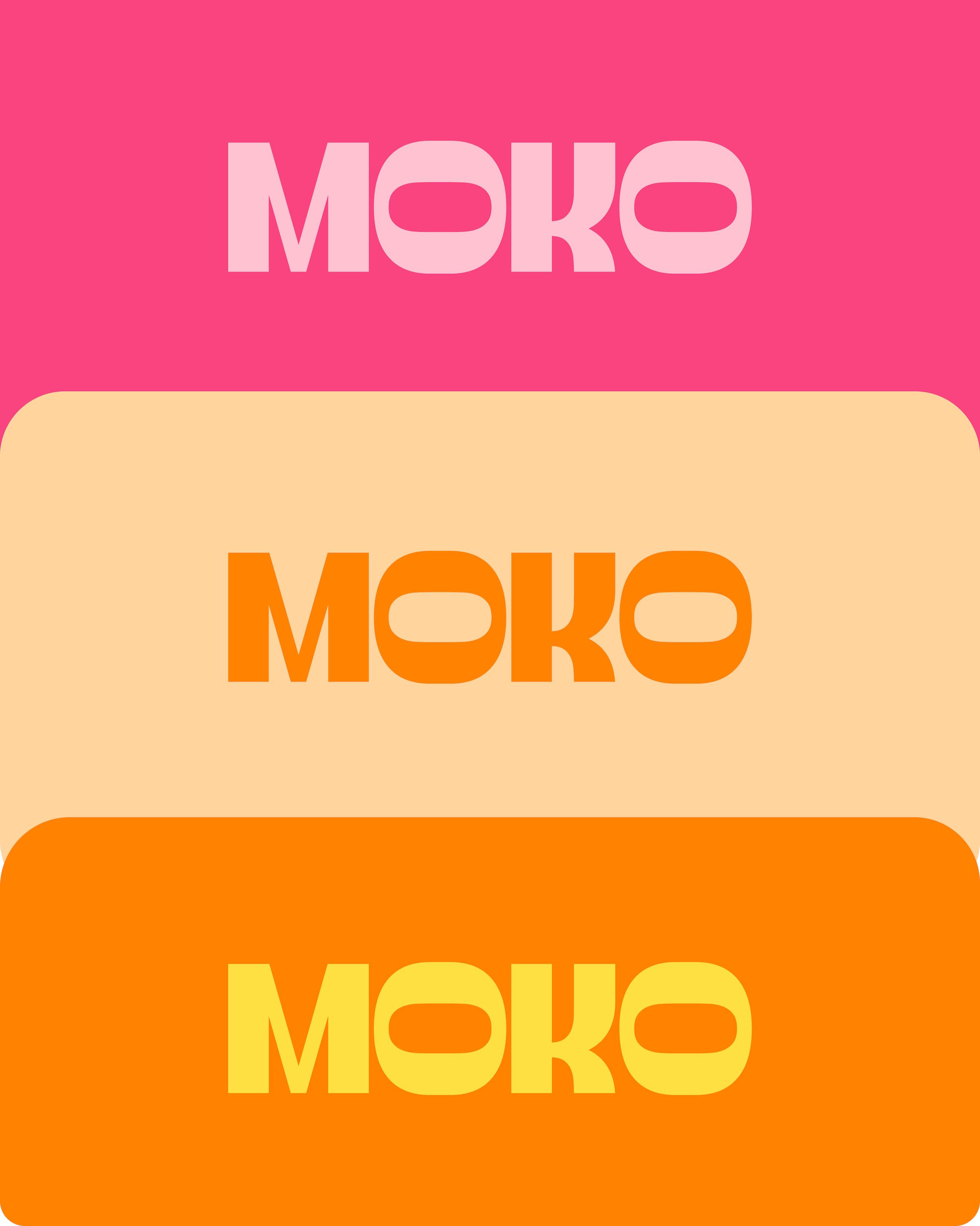
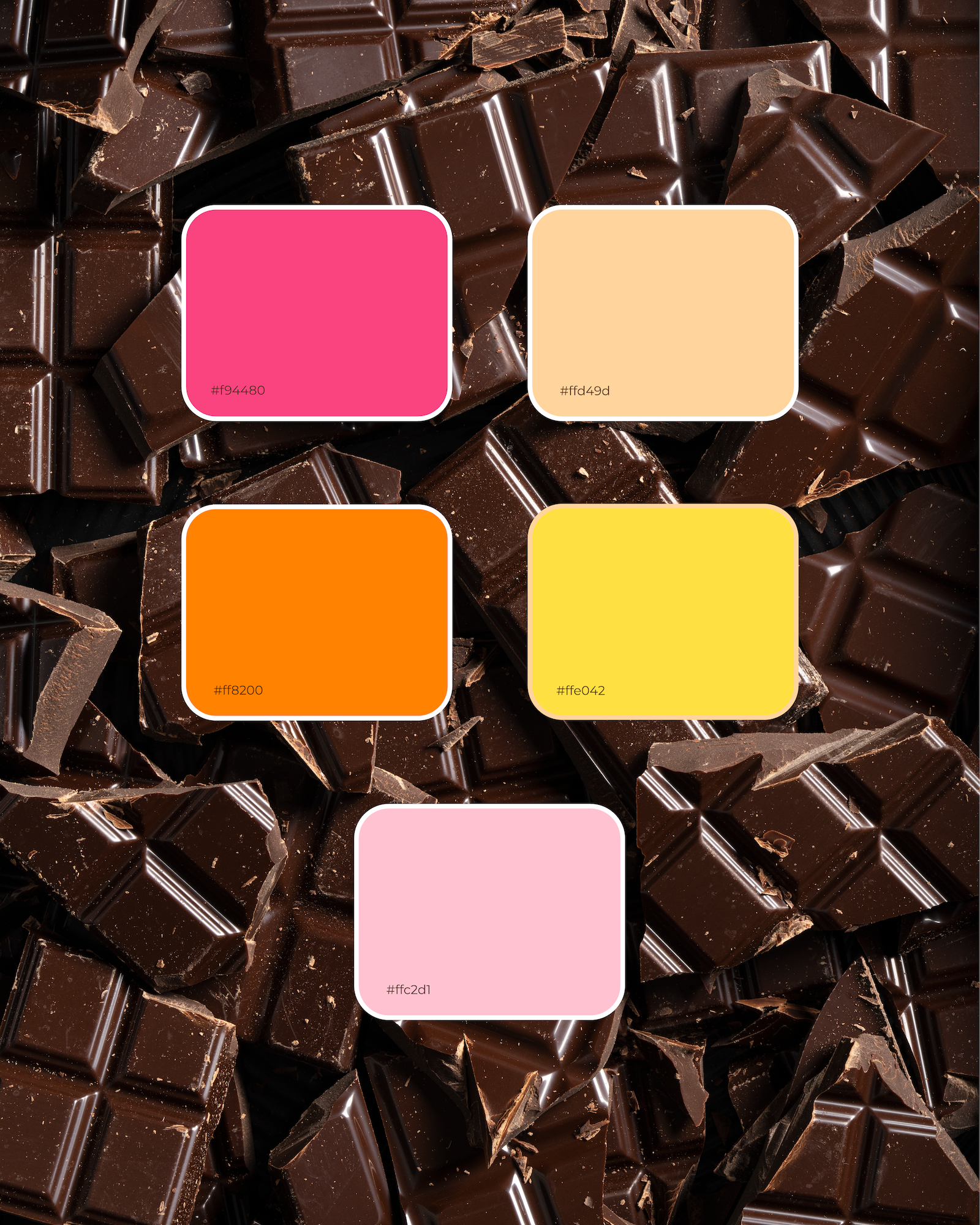
I built a flexible system using: Strong, custom type for the wordmark, Abstract, flowing shapes to echo the playful, unexpected flavors, Bold, high-contrast colour palettes that instantly signal each variety… Everything’s designed to stack, overlap, and catch your eye — whether it’s in-store or on screen. Super proud of how this came together!