
Studeo.
Online Education Platform
Services.
App Design, UI/UX Design
Project Length.
6 weeks

About.
Studeo is a comprehensive online platform tailored to each student’s needs, providing effective academic support through personalized tracking, diverse exercises, and invaluable tips. With individual dashboards, students can monitor progress and target areas for improvement, while parents can stay informed. A plethora of exercises reinforce learning and readiness for assessments, ensuring mastery of concepts. Additionally, Studeo equips learners with pedagogical strategies for efficient study habits, stress management, and exam preparation, fostering holistic academic success.
Problem.
The current design of the web platform is characterized by outdated aesthetics and an overwhelming amount of elements. Additionally, it suffers from usability issues, making navigation and interaction inconvenient for users. Moreover, the platform’s sales performance is low, failing to effectively convert visitors into customers.
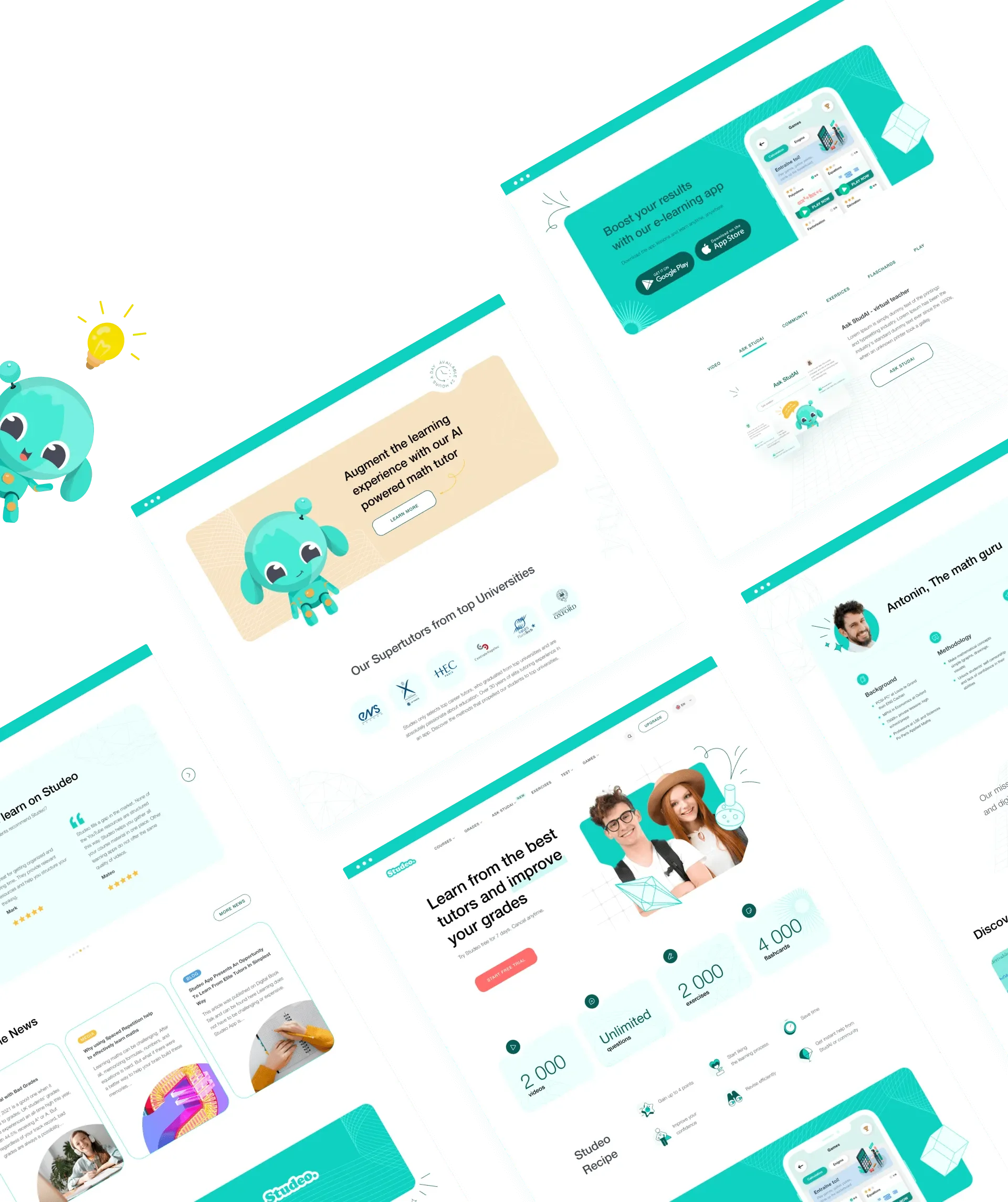
Custom Icon Set.
We crafted a collection of charming and appealing icons that seamlessly integrate into the website’s design, adding a unique touch to its aesthetic.


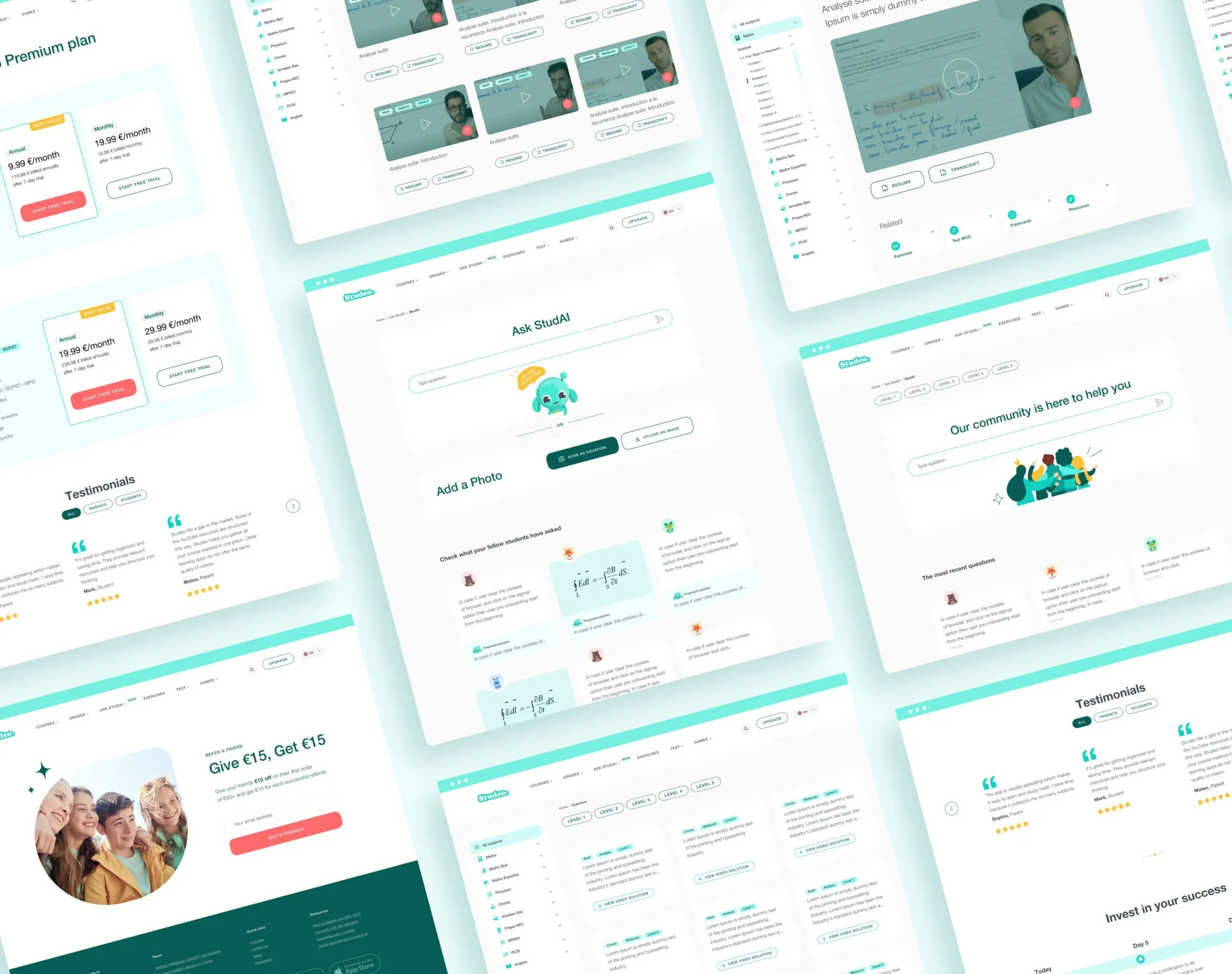
The Outcome.
The redesigned Studeo platform produced clear usability improvements across navigation, task completion, and content comprehension. Through restructuring the layout, reducing visual noise, and introducing a consistent design system, the interface now supports faster decision-making and more predictable user journeys.
Usability testing showed that students were able to locate learning modules, view progress updates, and switch between subjects with fewer steps and less cognitive load. Parents reported higher clarity when interpreting performance data, indicating stronger alignment between UI patterns and user expectations.
The introduction of a modular component library allowed Studeo’s internal team to maintain visual consistency across new pages and features, reducing design fragmentation and streamlining future iterations. The custom icon system further strengthened recognition patterns, enabling users to understand functions more quickly without relying on text alone.
Overall, the redesign improved information hierarchy, reinforced brand trust, and supported the client’s main objective: creating a platform where students can focus on learning rather than navigating a cluttered interface. The updated system provides a scalable foundation for future product enhancements and more data-driven improvements to the learning experience..

