

NELLÉ
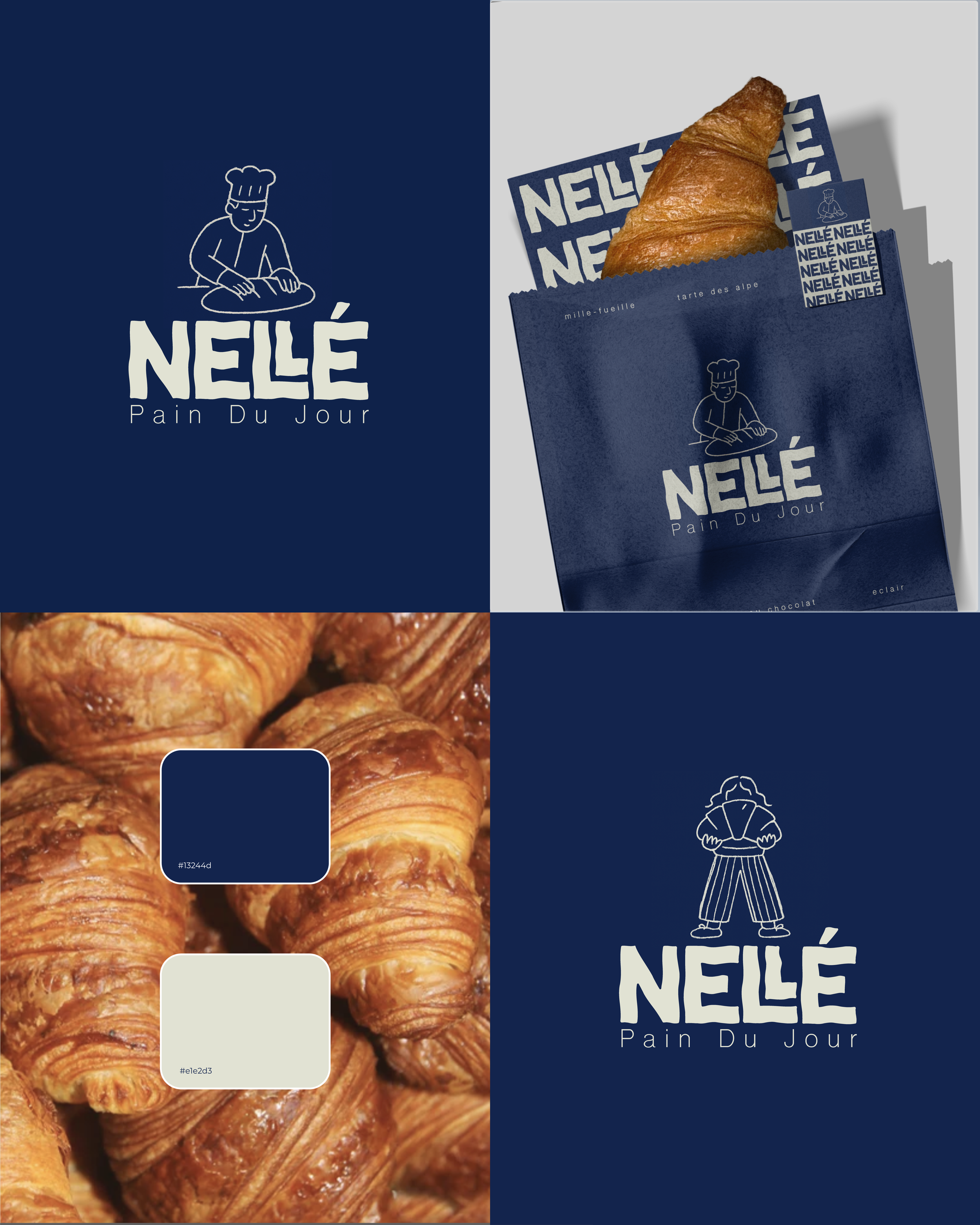
A deliciously warm brand identity for NELLÉ, a cozy French bakery serving up fresh pastries du jour. From the playful hand-drawn characters to the bold, rustic logotype, the goal was to create a visual language that felt artisanal, welcoming, and rooted in tradition. The deep navy paired with a creamy off-white creates a classic, buttery contrast, like the perfect croissant! Loved crafting every detail, from the packaging to the tone of voice. NELLÉ isn’t just about bread, it’s about bringing a bit of joy to your everyday ritual.
The hand-drawn logo is also complemented by a bold, hand-drawn font that feels both crafted and characterful — evoking the warmth and imperfection of something made. It’s confident yet approachable, giving the brand a memorable, artisanal edge. From playful illustrations to tactile packaging, every detail was designed to feel thoughtful, inviting, and unmistakably NELLÉ.

